![]()
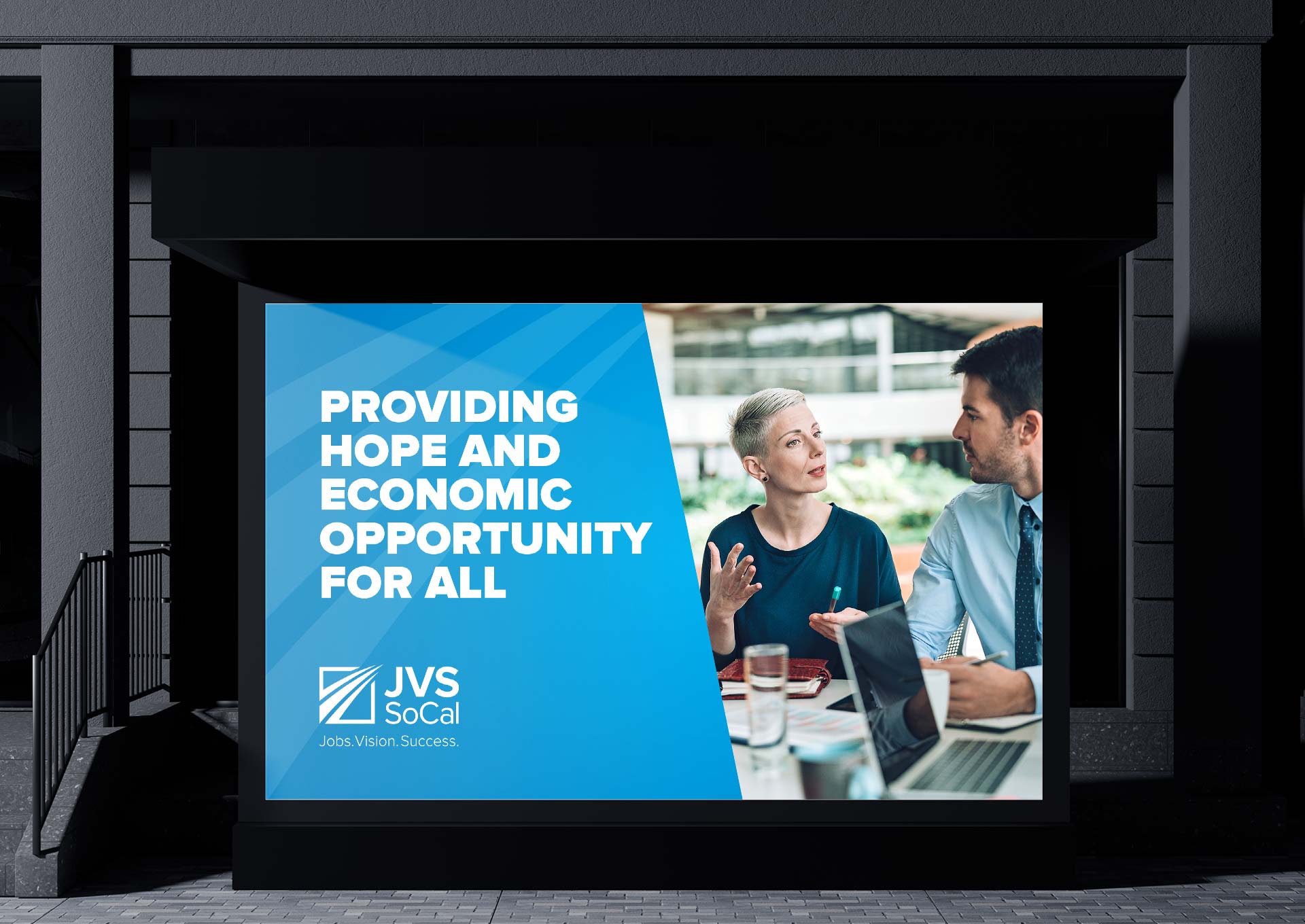
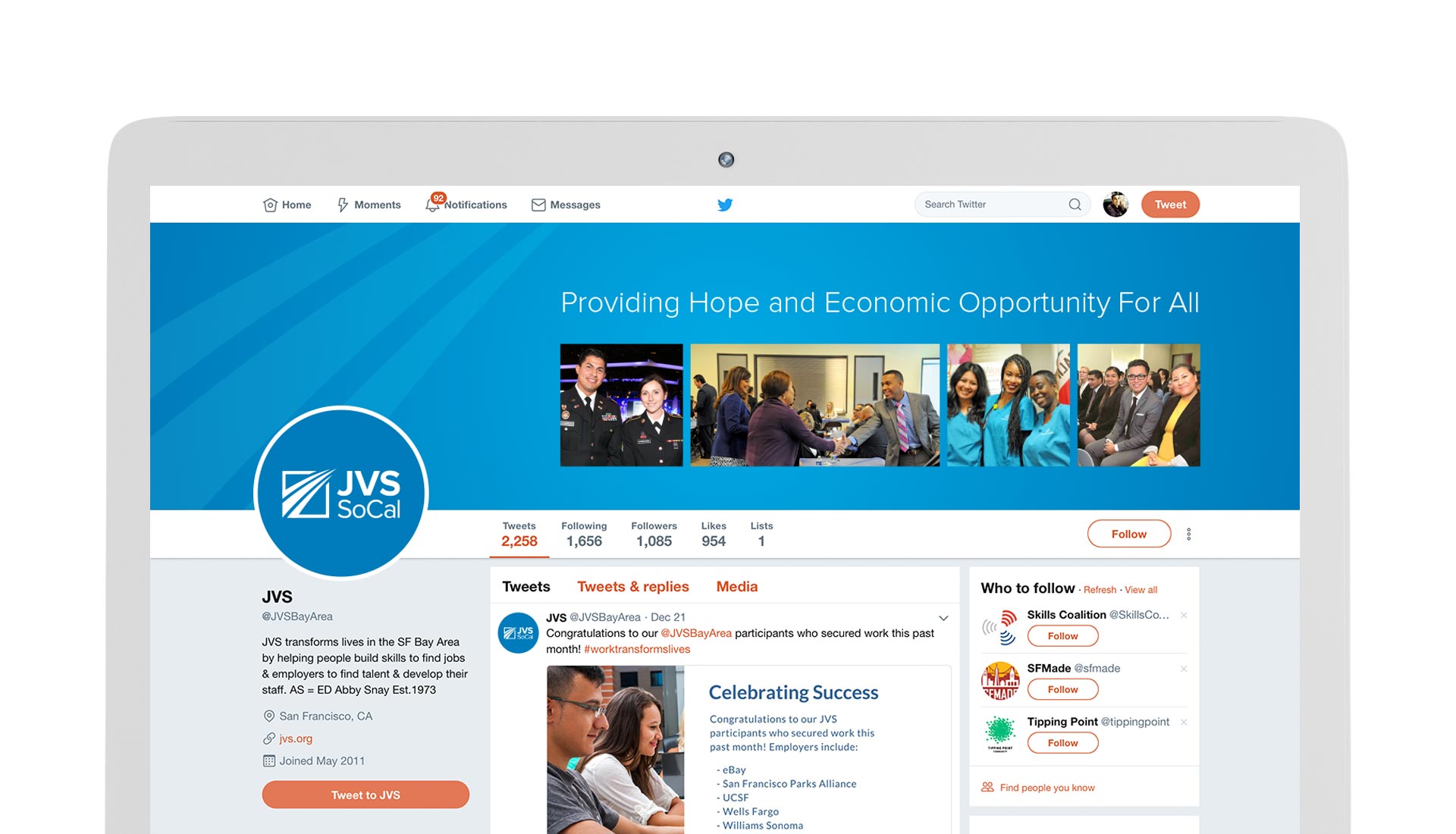
Design has the power to amplify voices and drive change, especially for mission-driven nonprofit organizations like JVS SoCal. When I volunteered to help them reimagine their brand identity, my goal was to create a visual foundation that reflected their legacy, values, and future. What began as a logo redesign evolved into a full-scale transformation—bringing new clarity and impact to how they present themselves. Through thoughtful design, I aimed to support their mission of empowering job seekers and uplifting communities across Southern California.


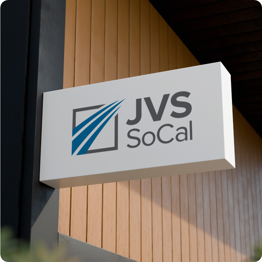
The JVS SoCal logo is built around three elements: the icon, the logotype, and the tagline—all coming together to symbolize motion, purpose, and empowerment. The icon features three blue pathways entering through broad openings and converging within a solid gray square, representing the organization itself. Each path moves upward and outward, embodying the journey of individuals who come to JVS SoCal seeking support and leave empowered to forge their own trajectory. The design honors the organization’s name—Jobs, Vision, Success—and reflects its role as a catalyst for positive, upward movement in people’s lives.
![]()
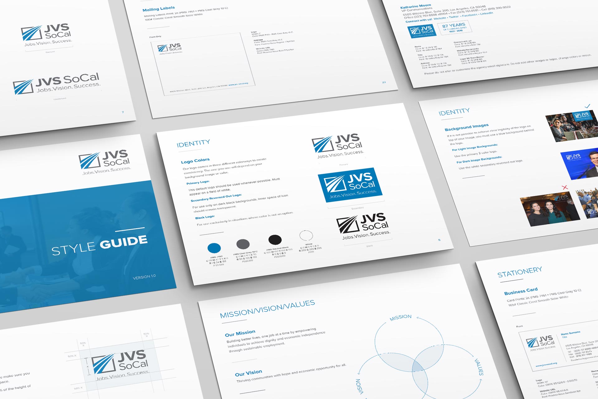
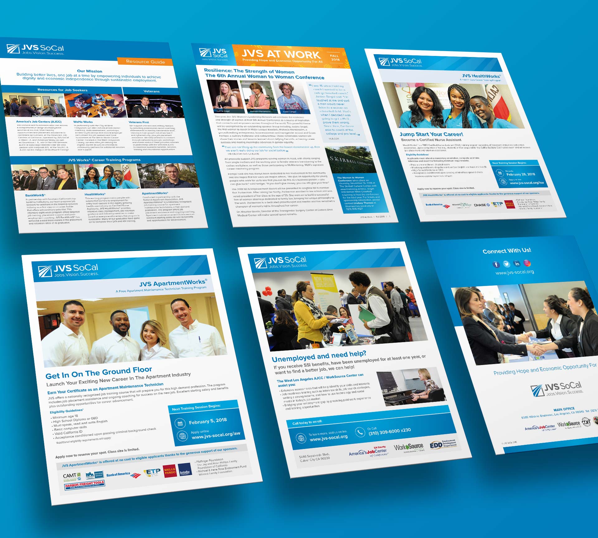
To ensure the success and longevity of JVS SoCal’s new identity, I developed a comprehensive set of brand guidelines. These guidelines served as a blueprint for consistency across all communications, defining the use of the logo, typography, color palettes, imagery, and tone of voice. More than just a rulebook, the guide became a tool of empowerment—allowing staff, vendors, and partners to represent the brand with confidence and clarity. It helped unify the organization’s visual language across departments and locations, reinforcing their credibility and professionalism at every touchpoint.


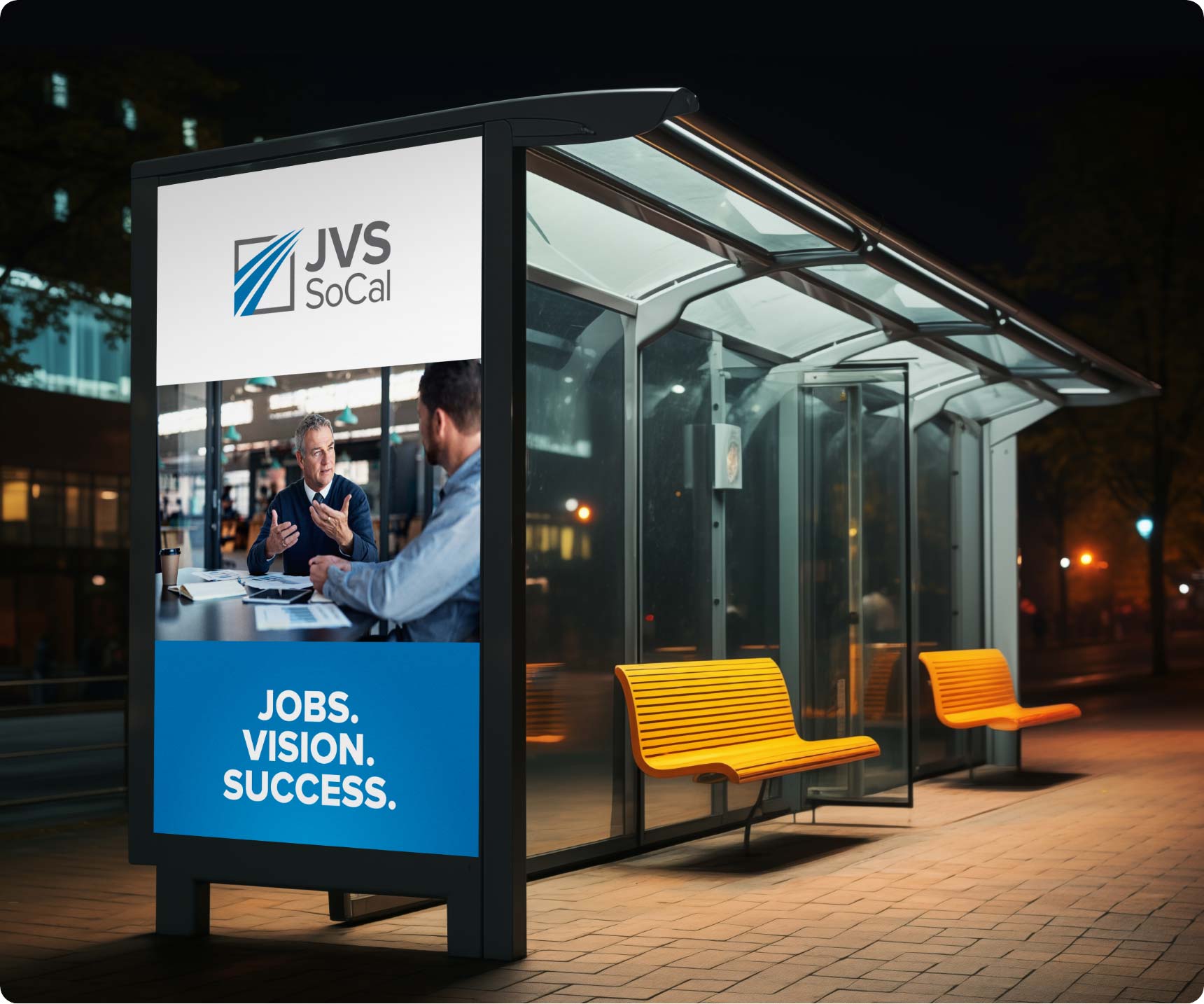
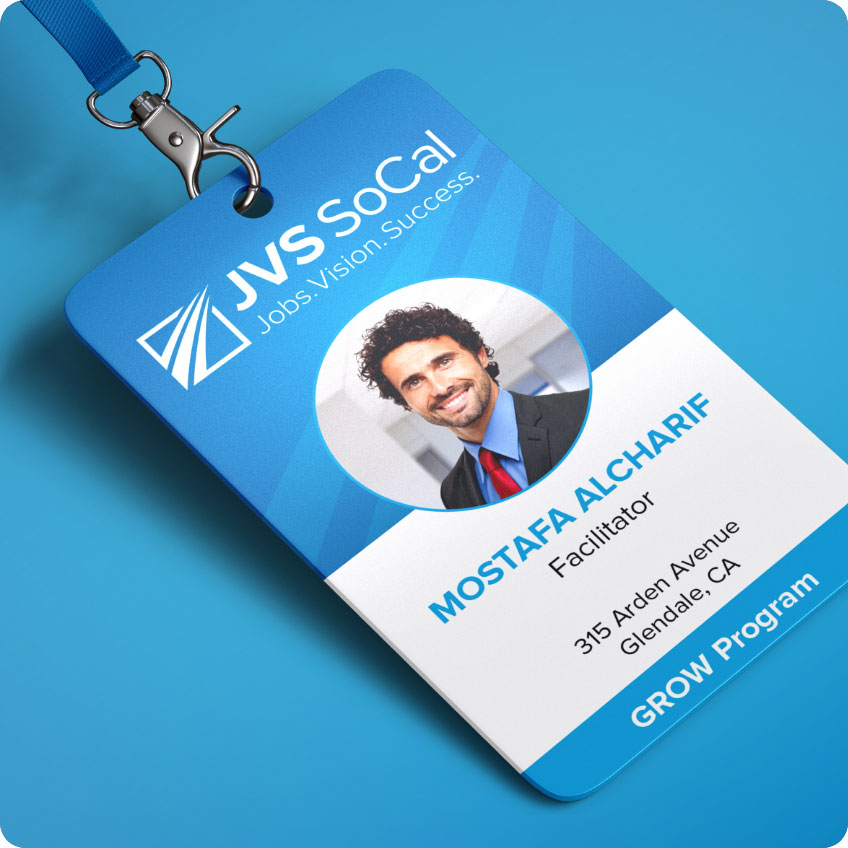
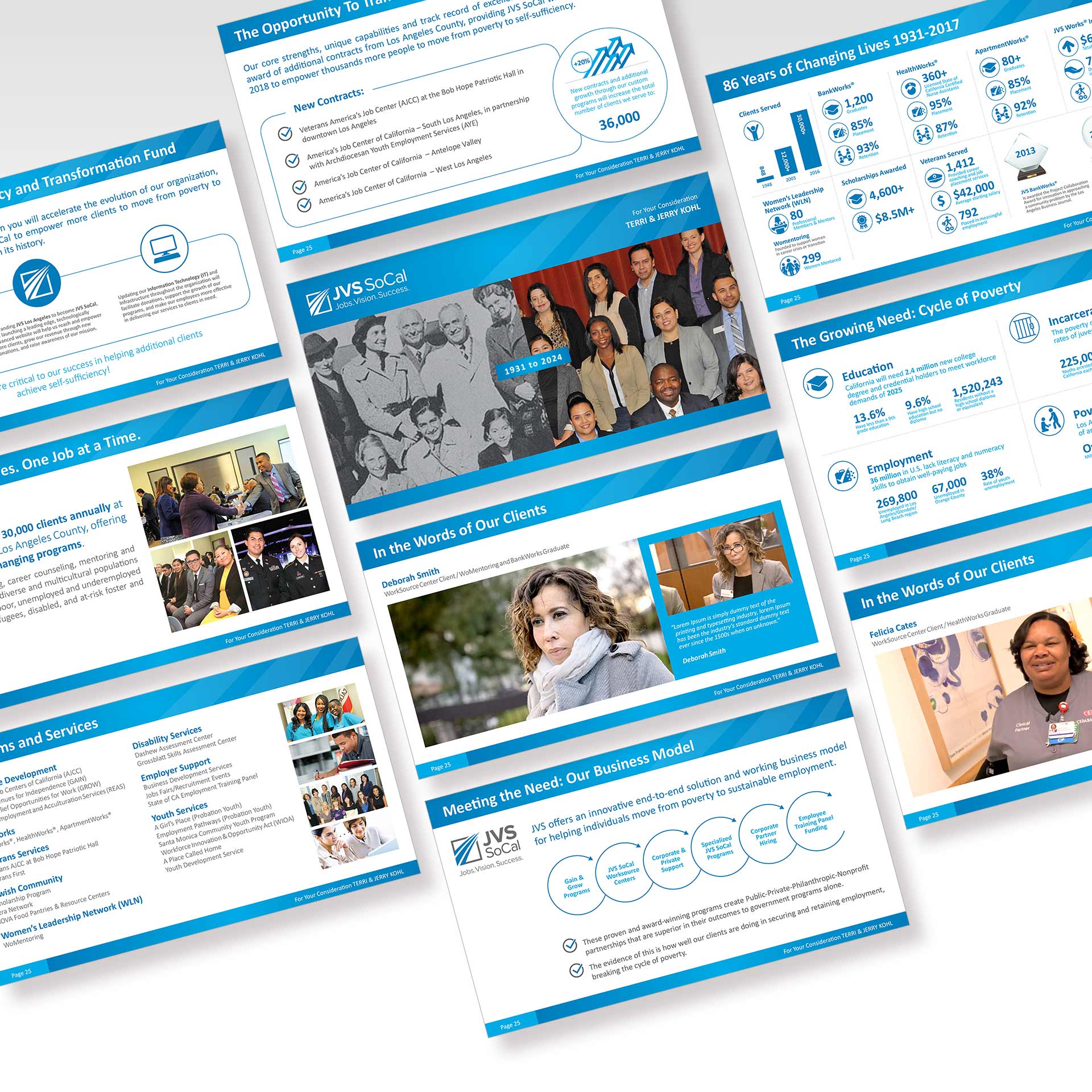
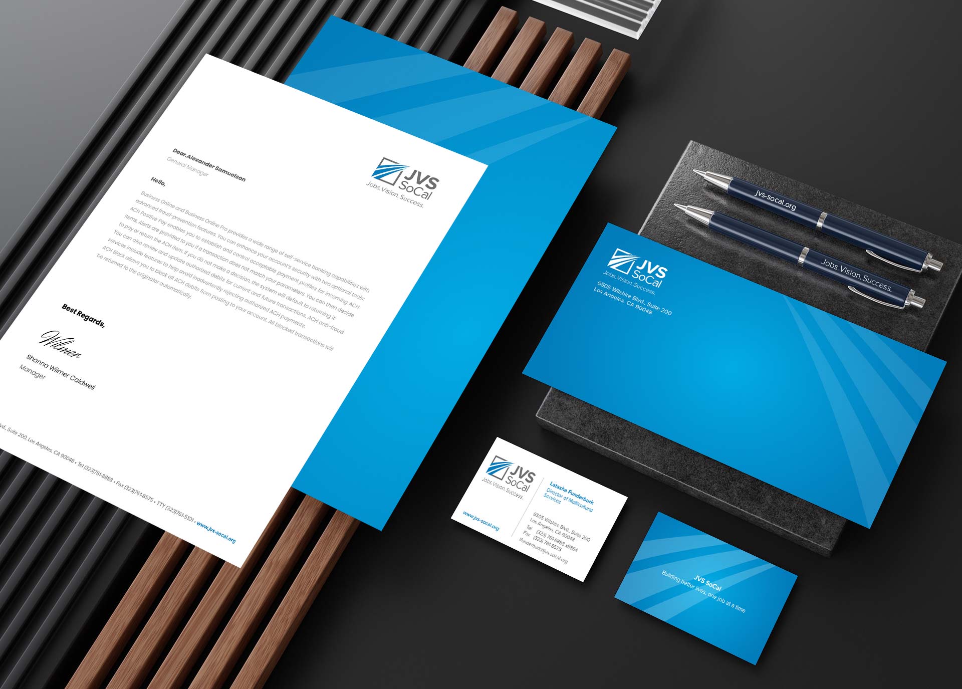
With the new identity in place, I led the design of a wide range of branded collateral to bring JVS SoCal’s voice to life. This included flyers, brochures, newsletters, resource guides, certificates, badges, stationery, promotional items, and social media graphics. Every piece was created with care to reflect the organization’s values and connect authentically with its diverse audiences. From internal communications to public-facing outreach, the visual system elevated how JVS SoCal presents itself—making their services more approachable, engaging, and impactful across the communities they serve.
![]()


![]()